We’ve been hard at work on our biggest update yet. Here’s what’s new and improved in September 2024.
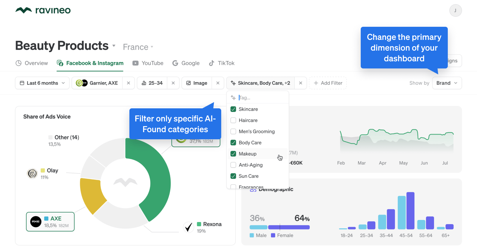
Share of Ads Voice
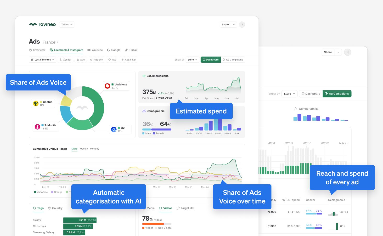
We now display Share of Ads Voice as a pie chart, making it incredibly easy to spot who gets the most attention on ads on social. Don’t worry – the timeline view (with Cumulative Unique Reach) is still there, too, so you can spot trends, spikes and turns of strategy by your competitors.
Platform-specific charts
Each platform provides slightly different metrics, and, more importantly, calls for displaying different data on your Dashboard.
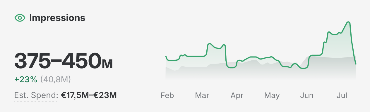
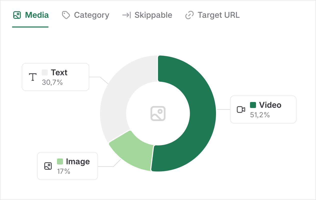
We now have platform-specific charts like Impressions and Platforms for Google, Video Length or Channels for YouTube, Media Type, and many more.
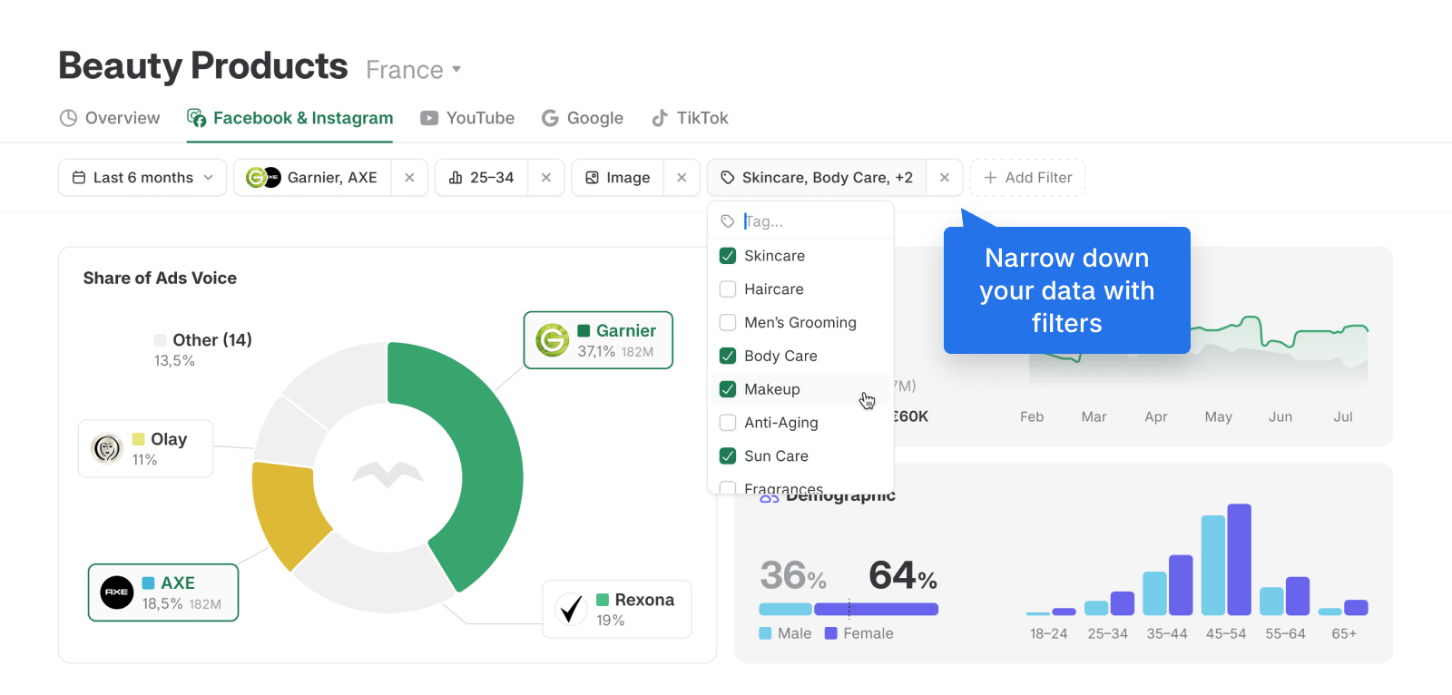
Powerful filters
You can now select multiple options in every filter. This, combined e.g. with categorisation, allows for advanced filtering down to the exact level you need.
We also moved switching between countries above the platform tabs. This aligns much better with how we and our clients think about what a dashboard is.
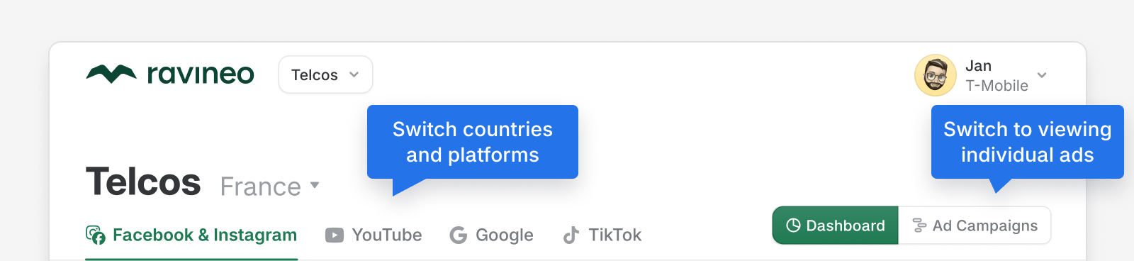
Ad Campaigns view
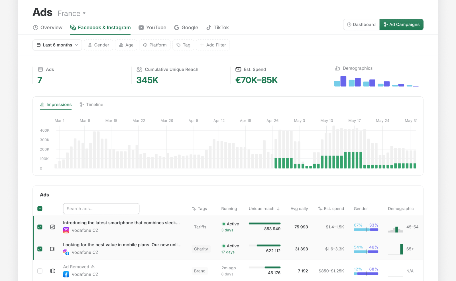
The Dashboard is your aggregated market overview. If you want to see individual ads, switch to the Ad Campaigns view at the top right.
There, you can see every ad run by any brand on the dashboard. And, if you select some ads, the chart will show you the selected ads’ impact on reach (or impressions).
Note: Previously, you could click on a brand on the dashboard and it would take you to that brand’s detail page with individual ads. We have changed that behaviour–clicking on a brand now adds it as a filter (essentially making your dashboard the brand detail page).
The benefit of this is that in Ad Campaigns view, you can now look at individual ads across any brands, topics, demographics, or more, based on how you filter the view.
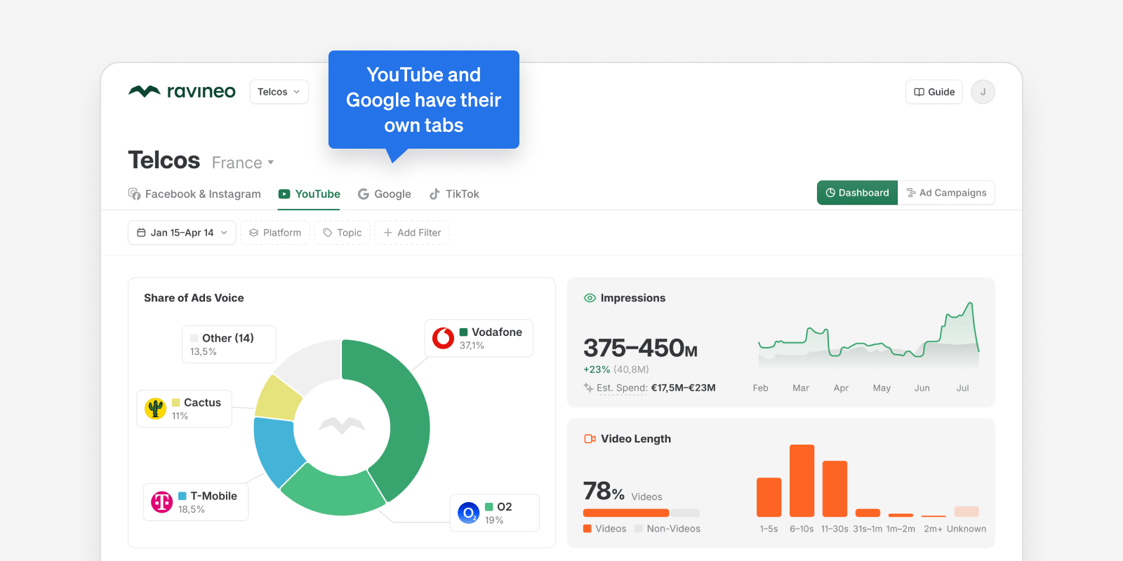
YouTube and Google platforms
We split the YouTube and Google platforms into their own tabs, based on customer feedback. Each has its own charts – like video length on YouTube, and sub-platforms breakdown on Google.
AI Categorization and dimensions
Our AI Categorization, as well as keyword-matching categorization, are available to more of our clients than ever before.
And, you can now choose the primary dimension you’re viewing the whole dashboard in! It sounds more complicated than it is. Simply put, you can look at e.g. Share of Ads Voice across product categories, not brands.
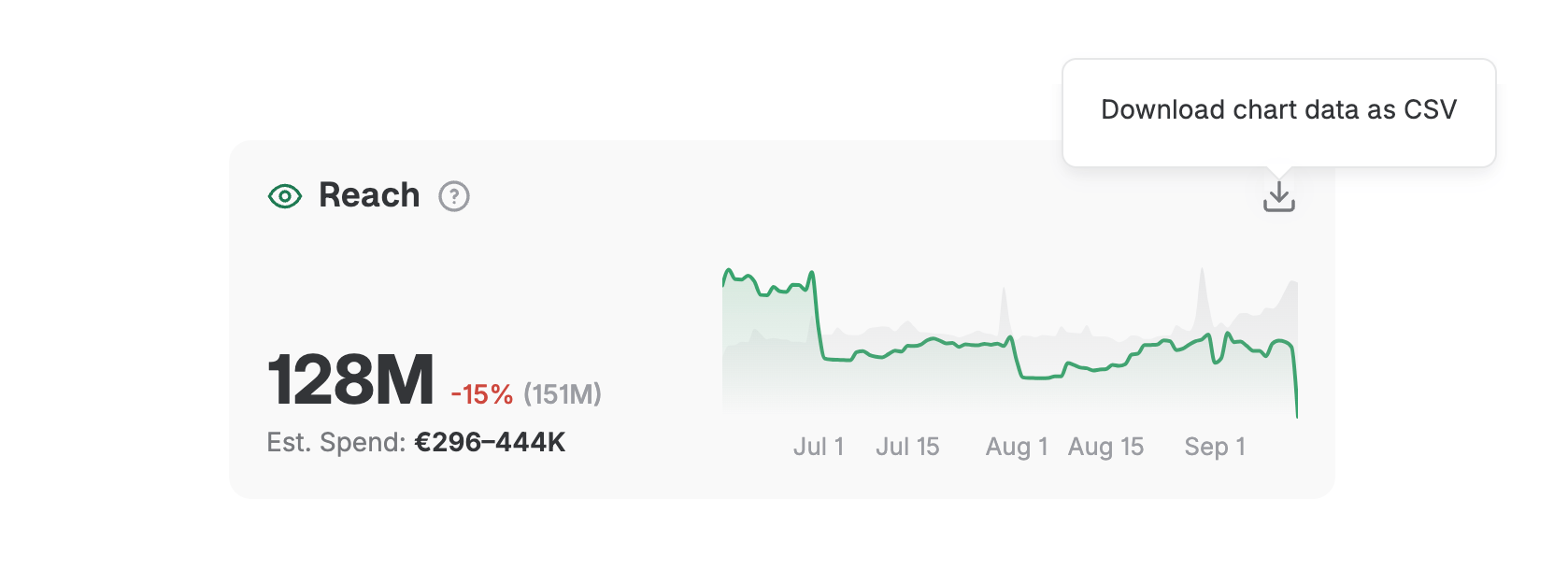
Exporting
Almost every chart and table has a new download button that will get you a .CSV, so you can take your data analysis even further.
Ravineo Guide
And last but not least, we created a living Ravineo guide to explain everything, and answer any of your questions. This section of the website will always be updated to reflect the product.